So… first you tease us with awesome black knights and say they will be a faction like the goblins and the next moment you say they won’t make it into the game? I might cry a little. Right here a my desk in work and everyone will wonder what horrible thing has happened to me. And it’s all on you. 
2 Likes
well i didn’t say they wouldn’t, i just said i’m super busy right now and can’t make them into a faction, at a later date when i have more time to play around with modding in a faction i’ll see if i can do it though…
i take full responsibility for any crying caused by my teasing ![]()
1 Like
though he could use a bit more work, here’s another one of the templar characters,

The Wizard
in the days long past he was trained in the ways of a Cleric by the holy ones, however since then the wizard has found a lesser known and much darker path to follow…
“Hmm… Whats that you say, you’ve heard rumors of us delving into black magic? well those are hardly rumors my boy…”
now i don’t know anything about the lore for the clerics, so that bit about being trained as one by “the holy ones” probably doesnt make any sense at all in the actual game lore, but who cares 
15 Likes
I think you could even actually make him work by using the same animation and a negative amount for healing (or is healing already negative damage?) would be pretty damn fantastic.
This thread has such a great collection of images, really inspiring 
I’m curious what a version of these latest sprites would look like with a new color scheme. I’d just like to make out the shadows more easily. Maybe something like this :
Props to @Simica_Na for linking that pallette tool in another thread.
2 Likes
and another Dark Templar unit!

The Knight
wearing a heavy platemail and crested helm, these are the toughest soldiers in the Dark Templar armies. unlike the footman, the Knights prefer to use single handed weapons and shields, they also prefer to use crushing weapons (hammers and maces) over using blades.
not sure i’m happy with the face section of the helmet, but other than that i’m happy with the way the knights look. i’m currently working on the templar weapons… seeing as i’m spending so much time modeling them, i definitely will make them into a mod later!
12 Likes
YES. Shut up and take my money
1 Like
I agree with Ludocrat - getting a little green in your shadows could help the dark metal read better. Black/Gray/super desaturation feels a little ‘dead’, where as colors in shadows make things feel more ‘alive’.
Doesn’t need to be complimentary colors (green with red), but something in there could help.
1 Like
and yet another Dark Templar character!

The Assassin
wearing a modified version of scout platemail, along with a hood, the Assassin is the most mysterious of the Dark Templar. She will use any one handed or ranged weapon, however she prefers daggers. as not much is known about her, there are thousands of rumors surrounding her back story.
“You heard that i used to be a spy for the Saber Army? huh, first time i’ve heard that one…”
i was having a bit of trouble designing new weapons, and by that i mean i already have so many designsz that coming up with anything new was starting to get hard… so i decided to “take a break” and work on another of the templar characters.
16 Likes
I am seeing some badass claws on the assasin. Perhaps those should be standalone weapons?
Oooh, speaking of adding some color - I like that green bandana ; ).
1 Like
This is what I was talking about @8BitCrab
I really enjoy the voxel stuff you post, I am still at the level before novice on this.

This is my first attempt at trying to make a Heartling like object, actually its my first attempt at creating any object. Hopefully I will be able to practice some more if I get time. I was gonna pull some inspiration from the ones you posted and see if I can reproduce some thing similar if that is ok. Still working on being more symmetrical.
1 Like
haha, i’m no where near being past the novice level, everything i make is just a re-colored/slightly edited stonehearth model…
well for a first attempt at something, that’s a lot better then my measly little shroom ![]()
you should definitely keep at it, even if you feel all of your models are terrible, just keep chugging away at them and you’ll get better ![]()
that’s fine by me, though what would probably be better is to just open the stonehearth.smod and use its models as bases. that’s what i do with almost all of my models. if you want any tips just ask and i’ll do my best to help you out ![]()
2 Likes
You should be able to copy/paste and then flip one side over to the other - that way you don’t have to do it by hand : ).
3 Likes
sadly you can’t do that with magicavoxel, however there are the “mirror” buttons,

they mirror all your actions on the selected axis.
hope that helps ![]()
3 Likes
by the way, @Ludocrat (and @botchiball) would you be able to expand/explain what you mean with the colors a bit more? (sorry for a slightly late reply)
(Sorry for the extremely large post)
Its kinda hard to do with voxels (or pixels) because there isn’t much resolution - but it helps a shadow look more realistic and less like a black hole when you use a color instead of black. I make it a point to never use black - there is always a color that can be used to get the same ‘shadowed’ effect but will look better. Let me find some examples:
Here are some pixel art things with color in shadow - they are generally pretty monochromatic, but even keeping a green section with green shadows still keeps a little more life to it.
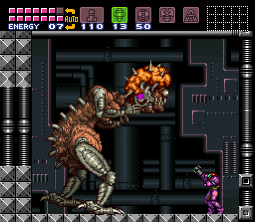
Notice the mother brain metal is actually yellow instead of pure black and white.
And some more resolution images:
This link has purple shadows:

This one has some extreme reds and some really desaturated blues:

Greens and blues in these shadows:

Nice greens in this one, also notice the bouncing of light - how the white outfit is blue from the reflection of the dress:

In comparison, look how much flatter or less alive these images are because of the blacks they use, either in outline or shadows:


http://img06.deviantart.net/3e70/i/2006/028/b/7/mike_tyson_by_8_bit_painter.jpg

And not to say this art is bad - the black in the shadow is just causing a certain look which is not very realistic or ‘lively’. Try taking a look at a photo of a face (or anything) sometime, the shadows will have TONS of colors in them. As I said at the start though, doing stuff in voxels makes all this much harder, but as a rule: try to avoid completely desaturated colors, and try to remember to use a color of some sort in shadows - and often that can be a compliment (but really its just experiment, what looks good?).
Hope that helps : ).
1 Like
that’s okay, next time perhaps try cutting down on the amount of pictures, if you need/want to show that many try providing links to them instead of actually posting them ![]()
hmm… well none of my colors are ever just straight up black/grey/white, i always make them be a yellow or blue grey. i think whats causing them to look pure black is magica’s render option, the dark colors all seem to just merge into one black blob…
i guess i should also say that i don’t usually add shadows to my models, so that might be the problem you’re having with them…
Hey boss, thanks for responding. So you realize that pure black is boring, because your using that dark blue instead. If it still seems like a black blob, maybe you could get a better contrasting color. I was recommending using cyan because it balances with red and brown for a better contrast. I don’t think shadows per se are lacking, but having your base color get brighter towards the top seems to work for the vanilla assets.
I may not have explained the tool I linked. This should point to the interactive part. It helps to be more exact when designing a color scheme. To get that particular shade of cyan I used a triad color scheme with your reds and browns. A tetra scheme with the skin tone and reds might bring out something more interesting. There’s an export button that will let you export as a palette file (or just a png) that hopefully will work with Qubicle.
Oh, and it can help you make sure your ties, makeup, accessories or outfits don’t clash. If that’s your jam.
Just trying to creatively critique what I see, but I don’t really know what I’m talking about. I never went to art school, and I rarely use any media beyond pen and pencil so I really rely on these sort of tools or guides whenever I want to colorize my sketches.
Here’s a great resource that DOTA 2’s team put out as a guide to help modders create content consistent with the game. It sounds really specific but its actually the best break down I’ve seen of how to use value, color, and silhouettes to create pleasing character designs.
And hopefully I don’t need this disclaimer but I’m only floating ideas not saying your work is somehow incorrect or uninformed, I really admire it as is.
2 Likes
Ah yes, I should have said that as well : ).
1 Like